
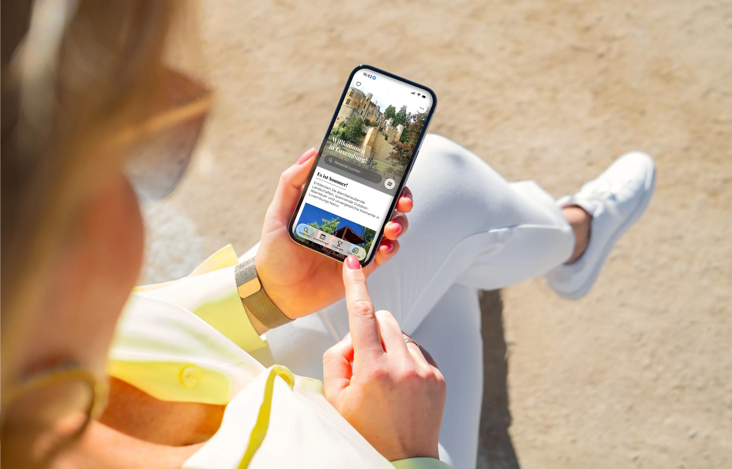
The redesign of the VisitLuxembourg App is an important step in improving the digital experience in terms of clarity and consistency. The objectives are to make the app easier for users to navigate, speed up searches for content and align the app more closely with the Visit Luxembourg corporate design.
Visual design
The app design has been reconciled with the iOS ‘Liquid Glass’ look, which uses translucency and soft layers to present content in a clearly structured way. Light Mode and Dark Mode allow users to choose the right contrast for the moment.
The card-based layout, clear font and deliberately minimalist interface foreground the information, with distractions reduced. The images have been refined to spotlight Luxembourg’s contrasts – between city life and natural landscapes, tradition and the modern day – and deliver a consistent user experience with improved accessibility.
Branding and consistency
The redesign has aligned the app more closely with the corporate design of visitluxembourg.com. Colours, fonts, images and icons have been updated to create a more consistent image across the website, app and other digital touchpoints. This will boost recognition and ensure a familiar feel – starting from any of the channels.
Navigation and user experience
The original trigger for the redesign was the realisation that content was often difficult to find in the previous structure. On that basis, navigation has been simplified, with menus being assigned clearer names and the information architecture being tightened.
Seasonal categories on the home screen – such as summer activities, winter offers and upcoming events – allow users to access relevant content with more speed and ease. The structure is flexible to allow for new topics to be added at any point.
Improved search and find functionality
The improved search function is a key aspect of the redesign. This unlocks direct access to all the relevant content, including attractions, events and tours accepting bookings.
Different content types have been organised to follow a standardised logic and are presented clearly. Filter and selection options help users to narrow down the search results. The improved search experience is seamless, allowing users to find specific content and just to get inspiration.
The search function has become a key starting point for app users, making it easier for them to find content across multiple navigation levels.
Languages and user experience
The app is aimed at a multilingual, international audience. With the app language settings now clearly visible in the app, users can select their language early on for a more consistent user experience.
As a result, visitors and locals will be able to find the content they’re looking for much more quickly, whether in English, German, French or Dutch.